| Groups | Full Data |  |
Source: Bureau of Labor Statistics. (full source, footnote)
Full Source: Bureau of Labor Statistics, Consumer Expenditure Survey, 2003
available at http://www.bls.gov/cex/home.htm, accessed 25 July 2005.
Data files are available directly from
ftp://ftp.bls.gov/pub/special.requests/ce, accessed 25 July 2005.
Full Footnote: The Consumer Expenditure Survey collects information from large random samples of the Nation's households and families on their buying habits (expenditures), income, and household characteristics using both a quarterly interview survey and a weekly diary of expenditures kept by respondents. The federal Bureau of Labor Statistics which manages the survey (the U.S. Census Bureau performs actual data collection) uses the data to periodically revise the Consumer Price Index, one of the primary gauges of inflation in the economy. The data is also used to track the welfare of different socioeconomic groups and to study the impact of policy changes on groups. For more information see the FAQ page available from the Bureau of Labor Statistics at http://www.bls.gov/cex/csxfaqs.htm, accessed 19 August, 2005.
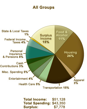
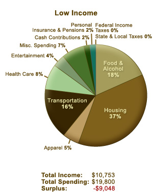
Surplus income is the difference between total income before taxes and total expenditures. If this difference is negative, the total represents deficit spending (spending exceeds income). Average spending among the two lowest income groups puts those consumer units in deficit. All other groups enjoy surplus income in amounts and proportions that increase with income and education.
A consumer unit is either: (1) all members of a particular household who are related by blood, marriage, adoption, or other legal arrangements; (2) a person living alone or sharing a household with others or living as a roomer in a private home or lodging house or in permanent living quarters in a hotel or motel, but who is financially independent; or (3) two or more persons living together who pool their income to make joint expenditure decisions. Financial independence is determined by the three major expense categories: Housing, food, and other living expenses. To be considered financially independent, at least two of the three major expense categories have to be provided by the respondent.
Income groups are combinations of all categories of consumer units for which data is complete. Education levels used here are selective with those falling outside the category definitions excluded from the presentation. Specifically, about forty percent of available data covering those with some post-high school education but not enough for a college degree and those with degrees or certifications beyond the bachelor's degree is not presented. Groups are defined as follows:
Low income: all consumer units for which income before taxes was less than $20,000 during the twelve months prior to the interview date, roughly those living in poverty. The poverty threshold for a family of four in 2003 was $18,810 (see threshold estimates from the Census Bureau at http://www.census.gov/hhes/poverty/threshld/thresh03.html).
Low Middle Income: all consumer units for which income before taxes was between $20,000 and $49,999 during the twelve months prior to the interview date, roughly those above the poverty line but at or below the median household income which was approximately $43,000 in 2003.
High Middle Income: all consumer units for which income before taxes was between $50,000 and $99,999 during the twelve months prior to the interview date, above but no more than about double median household income.
High Income: all consumer units for which income before taxes was $100,000 or greater during the twelve months prior to the interview date.
Less than High School: the number of years of formal education of the reference person is less than completion of high school or an equivalent GED.
High School Diploma: the reference person has graduated from high school but has not attended any additional college, junior college, or technical school classes.
College Degree: the reference person has graduated from college but has not pursued any graduate or professional education beyond the bachelor's degree.
For descriptions of expenditure categories see the footnote for the data table in the next second tab.

